
Warhammer Age of Sigmar
August 11, 2024
More About Warhammer Age of Sigmar
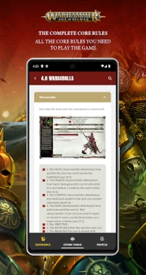
– Simplified core rules for the most recent edition of Warhammer Age of Sigmar
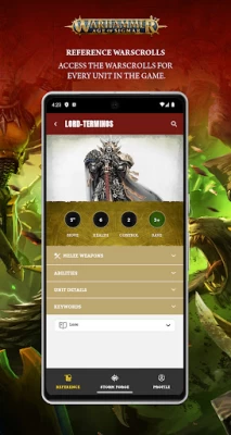
– Complete faction packs, battletomes, and warscrolls for every existing faction and unit
– Legends rules, armies of renown, and regiments of renown
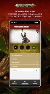
– Specialised warscrolls for games of Spearhead
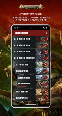
– Build armies based on your collection of miniatures in Storm Forge and crush your foes in combat
This is the time of turmoil.
This is the era of war.
This is the Age of Sigmar, and this app will help you dominate it!
Latest Version
1.0.1
August 11, 2024
Games Workshop
Travel & Local
Android
61,324
Free
com.gamesworkshop.aos4
Report a Problem
User Reviews

Ryan Sultana
1 year ago
Very bad ui. Have to click 3 or more dropdown menus to see what an ability does on a warscroll. Why are ranged a d melee weapons seperated and in dropdown menus when theres like only 1 line each? Clearly copy pasted from 40k app without any QA or testing. Atrocious design philosophy. Will only use for army builder, which also needs improvement. 3rd party builders are better.

Trevor Colaneri
1 year ago
The UI is atrocious. The old app was fine. I'm fully convinced that they did not play test this because no one would find this useful. There are too many drop downs and clicks to see anything useful. They spent so much effort making warscrolls readable and then threw it out the window for this cheap 40k port?

Ivo Capelo
1 year ago
App has horrible interface with unnecessary multiple nested collapsed boxes that make using it mid game infuriating. Sons of behemat extra artifacts and lores dont appear under the right traits. Most importantly i cannot copy a list that i previously made, the previous app was bad but this one is at a worse state. As a game dev stop hiring web developers to design game assistant ui.

Dustin Macdonald
1 year ago
Generally very good app. But there are too many clicks for some options. You've got dropdoen menus that go into more drop down menus for no reason as there is only 1 option.

Rob Landon
1 year ago
This App interface is atrocious. The labor it takes to get to anything makes it useless once the list is done. If this drop down novice UI continues I'll be looking for other tools to use during the game.

Lavendeer 201
1 year ago
As a beginner, this app works great for starting out an army and learning how things work. I see all the negative reviews and really don't get it :/. I'm a super casual player, so that's likely why. Seems like for beginners/casual, it's great. But for tournament-style playing and pros, doesn't seem to be the top pick.

Daniel Gee
1 year ago
Far too many drop-down boxes that aren't open by default, so you have to click over and over to read anything. The ability keywords aren't even clickable to go to the rule for that keyword. The regiment management doesn't let you save particular regiments you like, or move squads between regiments. It's a joke to think they'll want $5/month for this thing soon enough.

Michael Campbell
1 year ago
Great you actually can add regiments of renown. The only problem is it will probably turn up eventually like the 40k app were you have to have warhammer+ or you can't access most of the rules. Right know though that is not a problem, great app. The whole general has to be in a regiment thing is a bit weird though. Great Army Builder plus has all the rules for the units as well. Good for casual play.

Chris Schmidt
1 year ago
How many drop downs can they get in one app? Is there a record for drop downs they are trying to break? So annoying. Scrolling is okay.. faster even. This is when trying to be too helpful gets in the way, big time. Just layout the main details quick scrolling for gameplay and let people scroll.

Michael Page
1 year ago
App is useful for list building but a headache for using as a rules reference. Still got the issue from the last app where you have to click to edit a unit in a list before being able to go to its warscroll, and warscrolls are now worse than the last app. Weapons are hidden behind a drop-down toggle and the description of abilities are hidden behind TWO drop-down toggles which feels tedious to dive through every time you want to look at what a unit does

Luke Woolcock
1 year ago
I would rather use pen & paper than this app for gaming purposes. All the rules aren't in the same place, and I'd rather avoid having to scroll through each time I would like to look up a rule mid-game, especially this early into a new edition. Very tedious, drop down after drop down, I couldn't recommend this at its current stage.

Devin Michael
1 year ago
Decent for list building. But everything requires to many clicks, we don't need to hide abilities when units only have a few if not only one. Everything is hidden behind a collapsed section that you constantly have to open. Makes playing from the app a nightmare.

Jakub Kollárik
1 year ago
Still needs work. UI is mess. Its not intuitive at all. If you want add an artefact to hero you have to click on the dropdown menu of artfefacts. You see only the list of names. if you have no idea what it does is then you have to click on it. It will give you just the name of ability to that artefact.You have to click on the ability to see more..just 4 clicks to see what that artifact does.

Nick Stubbe
1 year ago
Does the bare minimum as a list builder. Checking actual rules on the app is awful as everything is nested in individual drop down menus (including hiding keywords like Wards and Power Level), and even has weapon profiles nested apart. The app is formatted in a way that requires a lot more scrolling than the previous app. Easily can be improved to a 4 or 5 star app, but if it goes the way of 40k and stops you from accessing warscrolls once battletomes release, it wouldn't be worth using at all.

K O
1 year ago
An inferior version of the previous app completely dominated by the need to copy the 40k app, which is itself pretty bad. Far too many dropdowns as many have mentioned and now they're going to pay wall it. The previous app was free and designed better than this rubbish. GW once again trying to nickle and dime players. Use it to quickly make some lists while it's in free beta but absolutely do not pay the subscription required for this!

Klerik AU
1 year ago
Completely terrible UI. It's a copy of the 40k app, but worse. Have to click through 5 or 6 drop downs just to see the ability of a unit. There's no screen like the 40k app that just shows everything you have in your list. Get rid of the drop downs, just show me what the abilities are. This is a serious downgrade from the last app. Likely going to just print out the pdfs at this point, the app is too inconvenient to use

Paul Gardiner
1 year ago
A downgrade from the previous app. The new user interface makes it difficult to see what is going on. It's now full of pictures and dark backgrounds making it hard to see compared to the old app which was clear and easy to use. The old app was free while this one is blocked by two separate pay walls. It's hard to appreciate paying for something worse when the last free thing was better... Do better Games Workshop or you'll end up losing customers.

Bernard van den Berg
1 year ago
All the information is there. However, compared to the previous 3rd edition iteration, the accessibility is way down. The continual tabs requiring additional touches are unnecessary and confusing. The information you're after isn't readily accessible. Once you click on a unit, open it straight into the full war scroll. It worked well in the last app, why change it?

Khazukho
1 year ago
Too many drop-down menus. It would've been better if you had kept to the older design somewhat; keep each alliance in a separate tab, each army in a separate tab, then sort heros and auxiliaries. Instead of having drop downs for everything, just have their full warscroll visible like the previews showed. Plus, the drop downs in the army builder are misleading. They dont show army abilities (like lores and manifestations) until you pick one. Please reduce the drop-down menus and just show things

Dave McGraw
1 year ago
Much improved over the 3rd edition app, but missing some features that make the 40k 10th app awesome. Notably, we're missing the "star/favorite" feature & the "command bunker" option on the army list. Commander Bunker option is sorely needed, as it is tedious jumping in and out of unit warscrolls during a game. Additionally, the errata/FAQ/addenda section is buried under the Glossary tab, making it harder to find. It slows down live games if rule/ability/interaction needs to be referenced.