
Real Estate by HAR.com - Texas
July 13, 2024More About Real Estate by HAR.com - Texas
• Award-winning HAR residential property search engine to find homes and rentals across the state of Texas.
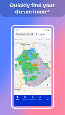
• Utilize the Drive Time search feature to locate homes available for sale or rent within a designated commute time.
• Connect with a REALTOR® to get access to Premium Content not publicly available on the HAR app.*
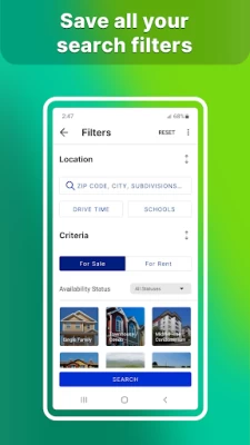
• Filter search criteria by what’s important to you, including proximity, price, square footage and more.
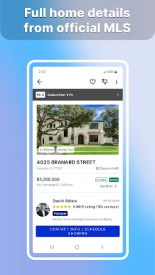
• Most comprehensive listing details include price, room dimensions, interior and exterior features, open house schedule and more.
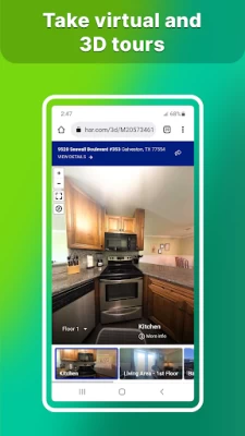
• Slide through an immersive photo gallery for each listing (includes up to 50 photos, which is more than you may find on any other app).
• Enhanced mapping with Street View.
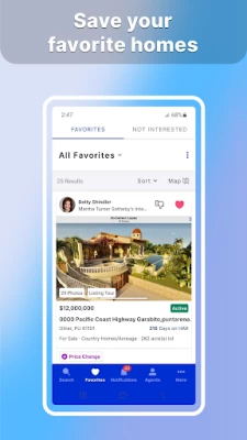
• Bookmark your favorite listings and easily share them with friends and family!
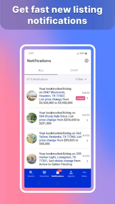
• Save your search criteria and get a notification when matching homes are posted on HAR.com!
• Live chat feature to connect instantly with any agent about any property.
• The Nearby Agents feature allows consumers to find agents who have listings near their location or agents who have had showings nearby.
• Information for more than 8 million properties in Texas, even those not currently listed for sale.
Features for MLS Subscribers Only
HAR MLS subscribers may log in to the password-protected members only area by using their HAR username and password. Members have access to their leads, listings, and their company’s listing inventory.
Detailed listing information includes:
• Complete listing details
• Days on Market
• Archive and agent full report (Listing price changes)
• Access to Tax Profile Report
• Showing instructions (if applicable)
• New Instant CMA feature lets agents create a Comparative Market Analysis report faster and more accurately than ever.
• Tax information (including values and tax rates)
We are always working to make the HAR.com app faster and more stable. If you are enjoying the app, please consider leaving a review or five-star rating! If you have ways we could improve, please send us an email to support@har.com. Thank you for being one of the 8 million HAR.com visitors each month.
* Premium Content invitations must come from a REALTOR® who is an MLS Platinum subscriber.
Latest Version
4.1.23
July 13, 2024
Houston Association of REALTORS®
Design
Android
859,042
Free
com.har.androidapp
Report a Problem
User Reviews
Sean N
2 years ago
This app is never the same day to day. You'll never know which feature will work or which one will not. Currently, no images show up for and listing. Some days, it will randomly reset all filters. Others it will randomly zoom in and out.
Ruben Loredo
3 years ago
New app functionality doesn't live up to the previous version. Search selections don't return in results list or map (example: when searching for multi family homes in a price range for 200k-300k; results will list residential lots and sfh outside the price range). Removing a favorite property takes two steps.
Jason Patton
3 years ago
The new update is BEYOND horrible! HAR for me has always had the best real estate app. NOW It looks and operates as if you reverted back twenty years! It's clunky, NOT user friendly at all.....THIS update is putting a lot of pressure on me to just settle for whatever home I can get, rather than the ONE my family and I want, just so I can delete it forever! Way to go!
Jenna Martin
5 years ago
It was working great.But the last few days I haven't been getting any notifications for new houses on the market for my saved searches.. & I was getting notifications all the time! I get notified abt price changes for homes I've hearted, but that's it. Please fix this. Also, some new construction houses aren't showing up on the map. They'll come up when I put in the address, & they'll be under "similar homes nearby" though. Other than that tho, ❤️ all the filter opt's & all the ways to search.
Michael Dean
1 year ago
The pictures won't open anymore. Fixed.
Leanna Wilson
1 year ago
Hard and confusing to use, I'm helping a friend, not trying to buy a house for myself this is just asking me to create an accnt and get a loan. smh I don't have time for all that, I just want housing options, not some cheap run around gimmick not a list of realtors to call for a list of the houses in their file.
James Colburn
1 year ago
Great app and fantastic info. As a realtor, I depend on up to date accurate info. This gives me what I need.
Mauricio Puentes
1 year ago
About 6 months ago, the app started to get too slow when you navigate on the map. The listings take too long (15 secs) to load. I have reported the bugs several times, and nothing has changed yet. Hopefully they fix it soon.
SayWHA Radio
2 years ago
I don't understand why its so hard to go from a saved search to a new search! Quantum physics is easier than navigation on this app! **UPDATE** Developer responded and said please show us how this is an issue, send an email. Sent an email with a video and detailing how this is a HORRIBLE UI for tryin to do a basic function for finding a home and it was immediate deemed SPAM by a human. Not a service. They do not care about how anyone feels about the app.
LaShonna Bahr
3 years ago
I came here to suggest fixing the readjusting zoom, but I see it's already been commented on several times. To elaborate, when I zoom in to an area, it zooms back out slightly as if it's adjusting focus. It's obnoxious when I'm in a hurry to see homes in a particular area. I would like to control exactly where I stop zooming. The second thing that I think is a downgrade in the new update, is needing to scroll down to get directions instead of hitting the next tab. Please fix these 2 issues.
Simon Flores
2 years ago
The initial search is good. If you select only homes for sale, the app constantly reverts back to all homes, even those already under contract. The other issue I have had is that the available homes listed reverts to every home in Texas. If I search Houston, that is the only city I want. Not Denton, Dallas, El Paso, Harlingen,....when you have to constantly exclude homes under contract, and re-enter the city you are looking for a home in, the app gets irritating real fast.
A Google user
5 years ago
Kinda finicky, very sensitive, not too user friendly in my opinion. I always have to reset my search filters bc they don't save, when they're not ignored. For example, when I choose to only view lots for sale, lots under contract, pending and sold still return. I can't buy a property that is already sold, that's why I chose to only view lots with a for sale status. Really annoying.
A Google user
7 years ago
OK app. Zillow is much better (although with a lot of unnecessary features) but HAR has better content. One of the main issues is the search. It's really rather bad if you want to search an area that doesn't fit one of the proscribed list of values. Right now I'm looking for homes in the Northside Village area of Houston. This isn't an MLS defined area. I could type Northside Village into Zillow and it would work. On HAR the equivalent would be ZIP = 77009 And MLS Market Area = Northside. But the app won't let me enter that combination, just one or the other, to "give me more results". I don't want more results. That's why I'm using the search parameters, to filter said results. Very frustrating!
J R
3 years ago
New update is horrible. When you click on a home, then click on the image to view pictures it just takes you to another page with the hime info and the annoying banner with the agent info that takes up half the screen. Then you have to click a THIRD time to actually view the images. It's pretty annoying. Oh, and nearby search no longer zooms to my location even though permissions for location never changed.
Brenna Souza
2 years ago
The app is fine for the most part, except I continually get notifications and when I click on them it takes me to my saved search and shows "no updates" and is empty. Does this all day telling me updates to my saved searches but when I go there, it says nothing is new. So the feature is useless. Otherwise it shows most of the relevant info, pictures and map viewing is good, and the contact feature works well.
Arturo Sifuentes
2 years ago
The UI... the entire map decides to zoom out when you want to redraw your search area...every...time. The little window that pops up whenever you (usually accidentally) tap on a house is not dismissable with a simple swipe down, no, if you even so much as touch it, it takes you to another window unless you tap the small x or press your back button. It's frustrating. Also can the "not interested" houses be a different color or tag or something?
S Val
3 years ago
I loved this app but the new update is absolutely terrible. The app no longer shows where you are on the map in relation to the homes you're looking at. When you click the location button it moves the map but doesn't actually show you the blue dot and where you are. The filter section is no longer user friendly. The app was MUCH better prior to the update.
A Google user
5 years ago
Save search feature is awful. You set up all the filters and save it, but then it refuses to notify you of anything. And if you try to edit the search filters at all it completely resets all of the other filters so the only one saved is the one you tried to change. Sometimes if you reload the app it might come back, but sometimes you have to input everything again, hope it saves even that, and if it doesn't repeat ad nauseam. You better just get it right the first time.
Nick Glaeser
3 years ago
Glitchy (7/27/22) - ever since the rollout of the updated app, it has been very glitchy toggling between map view, list view, and listings. After selecting a listing from map view, it brings you to the listing details, but when you hit the back button (to go back to the map view where you left off), instead of going to the exact place you were on the map (where you left off), it zooms way out over a huge portion of Texas or a completely different location.
Russell Fogg
1 year ago
Very informative. I don't like the way some of the things when you back up to go review something else, The way it can get lost. I worry sometimes about trying to find land. Some of the realtors are very uninformative about problems. Like land being landlocked, no right aways to get to the property. In 2024 I'm surprised that Texas would allow land to be sold or for sale that you have no access to. But the app is very helpful.
