
Garmin Connect™
June 15, 2024
More About Garmin Connect™
With Garmin Connect you can:
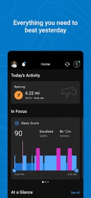
- Personalize your home screen, so the most helpful information is instantly visible
- Analyze your activities with detailed statistics(3)
- Create customized workouts and courses
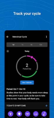
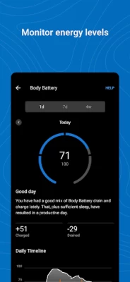
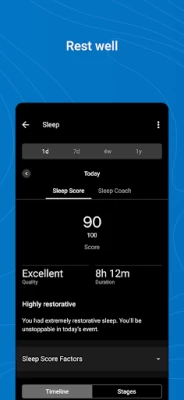
- Review trends in health metrics like heart rate and steps
- Earn badges for accomplishments
- Sync with other apps like MyFitnessPal and Strava
- Get support for Garmin devices and their features
Learn more about Garmin devices and how they work with the Garmin Connect app at Garmin.com.
(1) See compatible devices at Garmin.com/BLE
(2) See a full list of compatible devices at Garmin.com/devices
(3) See Garmin.com/ataccuracy
Notes: Continued use of GPS running in the background can dramatically decrease battery life.
Garmin Connect needs SMS permission to allow you to receive and send SMS text messages from your Garmin devices. We also need call log permission to display incoming calls on your devices.
Latest Version
5.1
June 15, 2024
Garmin
Tools
Android
35,485,764
Free
com.garmin.android.apps.connectmobile
Report a Problem
User Reviews

R Chen
1 year ago
NOT HAPPY with the latest update. Info i used to be able to see by just scrolling down the home screen now requires clicks to navigate to. Very limited options to customize so I'm stuck with it. Can't even go back to previous version. Ugh!!!!! Original review - Love the free app..a lot of information. Interface is clean and simple once you figure it out and configure it to you liking

McCall Anger
1 year ago
UPDATE: The new update is also full of glitches. In the last month the app has "forgotten" my watch twice and I've had to go through the entire initial device setup process again. FYI never experienced this issue before the update ORIGINAL REVIEW: Always loved the app, very functional, easy to use, and visually appealing. The new update tanked the interface. Your view is tiny, you get less insights, absolutely terrible view. Will definitely not be buying another Garmin with this interface.

Anne Collier
1 year ago
It stopped working when they 'upgraded' it, won't sync with any of my devices. It shows the devices connected, but each device and my phone all say they aren't connected. No amount of syncing fixes it, nor did rebooting all of them. I want the old version back, this one is useless.

bloop bloop bloops
1 year ago
i absolutely love my watch and the OLD phone application. since the update: Horrible UI. Was much better to navigate and see at a glance before the latest major update to the User Interface. Also, although my bank is participating in Garmen Pay, when i try to add my card through the app, i keep getting error messages saying, "please use a card that is supported" or some ish.

Khadija Morgan
1 year ago
Change it back! I don't like this update. For example, I don't want to see a graph of sleep data on the home screen. I just want the numbers without having to click on it. The old version was much more user-friendly. Now, I have to search for the data that I want by swiping and clicking a bunch of times, where it used to be on the homescreen. The data from the watch is limited without the app, so I'm considering getting a Samsung watch.

Seth Norton
1 year ago
Like many modern apps, sacrificed usability for "beauty". All the in-depth data (the main selling point of Garmin) is now hidden behind at least one or two more clicks to find, and good luck intuiting where they actually are. Also it won't let you sync to Withings smart scales which makes me think the push for weight and "fitness age" is just to sell their new smart scale. Short term gain for losing the communities trust.

Candice B
1 year ago
The new re-design is terrible! Absolutely awful! Can't find anything easily, the layout is beyond unhelpful. It's so irritating I'm seriously about to just get a Samsung watch. Please go back to the old design! Continued issue remains with app settings and syncing the watch itself. Every couple months I stop receiving text notifications on my watch. Settings haven't changed. Have to repeatedly recheck texts in notifications, sometimes it works sometimes it doesn't 🤷♀️

Benjamin Huntsman
1 year ago
The new home page is a disaster, everything used to be easy to navigate and now it's such a pain. I've also noticed since the last update that my sleep tracker has stopped recording properly, it will either say is was sleeping for 30-some hours, or will record nothing at all. What happened? This used to work just fine and not it's disappointing at best.

William Stinger
1 year ago
The most recent update was a big step backwards on ease of use. Everything I needed used to be just listed in easy horizontal rows. Now some things are "in focus" others aren't but you're capped at 8 items. If you want to look at something other than those 8 things then you have to dig around through menus. The "last 7 days" and "yesterday" summary used to show a whole list of things now it is cut down and is much shorter so is missing many of the things I want to review at a glance.

Jennifer N
1 year ago
I've had this watch since the end of November and things were good with it...until this most recent app. Now, I can't even use the damn thing for a watch, much less anything else. it's got 2 to three layers to try and figure out in the 3 seconds it gives me before the screen blabks out. Unless someone from the tech deparrment has a patch of some kind, I've got nothing more than a useless P.O.S. hangung on my wrist. Someone PLEASE fix this!

LK Tag
1 year ago
I'm not quite sure what the app development team is doing, but every "update" seems to just be going further away from functional. Now...my app will NOT sync with workout data or my predictive fitness app. Before a month ago, I had absolutely no problem with my rundot workouts syncing to my connect app so I could push them through to my watch. Then, that stopped happening two updates ago. Now, after this latest update, my watch won't send my workouts to the app! WTH?!

David Wheeler
1 year ago
The new interface is not as user friendly as the old one, forcing a scroll to get current data instead of an easy at-a-glance review. There are no options to get a condensed view. Features are still strong, but usability declined with the latest update. The daily summary web version link also no longer exists as a workaround.

rb g
1 year ago
I ordered a new watch but I don't think it will be as good of an experience until the App is fixed. The ui is freaking annoying. I don't like the new UI at all. I tested it as a beta and went back to stock - wish I could again. It's slower to use. You don't get at a glance what you did before. It's like it was prettied up by someone who didn't use it. It gets more annoying with use! Please, can we have the old one back?

Nathan GH
1 year ago
Edit: The new UI has too much whitespace and requires too many taps to get to the info I use. The new body battery graph for 7 days and 4 weeks is terrible - I can no longer see trends, just the high and low for each day, which is useless to me. I've stopped using it, except checking once in a while to see if Garmin has fixed it yet.

Blake Stockman
1 year ago
Putting a One Star for now. Garmin made the switch on the landing page/home page and it was not an improvement. I've edited the page several times and I have just tied to "get used to it". What ended up happening is I just open the application less and the watch has become less appealing. Just my two cents: bring back that full at a glance page or some equivalent of that.

Austin Lee
1 year ago
literally reviewed maybe 3 apps in my life. change this ui back to the old. this is trash. so clunky. even if you configure it to show only what you want on the first page, the way you navigate each module is different and much clunkier. also seems as though it fails to track my sleep as well as it used to before the update. and when i try to add manual sleep entries for naps, it forces it to list it as 26 total hours of sleep instead of 2. there is no option to specify date. just time

Jessica Trotter
1 year ago
Update after 1 month with 5.0: UI/UX doesn't work for me. I want a list view for today's metrics. I don't visually process the charts well so I'm not seeing the information I want even if it's on the screen. I don't want to scroll for my "at a glance" view. Why limit to 8 on at a glance? Some of the things I want to track aren't available! I'm checking stats on my watch since it's an easy to digest list view.

Albert Nowakowski
1 year ago
Absolutely hate the look of the new update. They've made it so I have to sift through more of the social media like features in order to get to the data my watch is collecting which is the only thing I care about. The data used to be in nice sections with good looking charts but now it's all in ugly gray rectangles. I wish it was easy to downgrade the app back to what it was.

Ross Kaplan
1 year ago
Explicitly rating low because of a recent UI update. The old UI worked very well and made it very easy to access data. The customizable UI did a good job at highlighting both daily and weekly fitness details on a single screen. The recent update seemingly intended for simplification, but instead it crippled the experience. No idea how a UX team and user testing would release this. Garmin, please see all your recent reviews, and restore the previous UI, or give users the option to switch.

Anneli Kunze
1 year ago
Just because you CAN change something, doesn't mean you SHOULD change it. Making data fields smaller, and in stupid tiles that require more tapping around to see what we want was definitely a choice. A terrible and stupid choice. This UI is actually worse now with no useful benefits to show for it. There was nothing wrong with the previous version. Change it back.