
Feedly - Smarter News Reader
July 14, 2024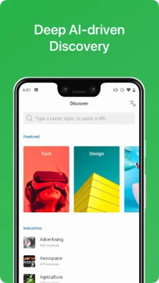

More About Feedly - Smarter News Reader
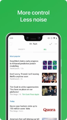
With Feedly, you can easily organize all your publications, blogs, YouTube channels, and more in one place and consume and share more efficiently. No more zig zagging. All the content comes to you in one place, in a clean and easy-to-read format.
People use Feedly to read blogs, learn new topics, and track keywords, brands and companies.
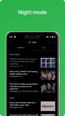
Faster access to lots of different sources of news and information means that you can more easily keep up with important trends in your industry and build up expertise on the topics you really care about.
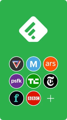
Because Feedly is connect to more than 40 million feeds, you can really go deep and find the niche content that is specific to your work or passion - this is a big difference from alternatives that feel very shallow and random in the content that is available.
From tech to business, design to marketing, media and beyond, Feedly helps you discover great feeds that you can organize in your feedly and read in one place.
Because it is powered by RSS, Feedly is an open system: you can add any RSS feed and read it wherever you go. Just enter the URL of that feed in the search bar or search for it by name.
Feedly offers useful integrations with Facebook, Twitter, Evernote, Buffer, OneNote, Pinterest, LinkedIn, IFTTT, and Zapier so that you can easily share stories with your networks and teammates.
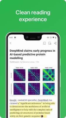
We believe in speed and simplicity. We spent a lot of time making sure Feedly is the best free reader available on the Android phones and tablets. The app loads fast and offers a simple and clean reading experience.
The best way to start is to search for a blog, magazine or newspaper you like to read and add it to your Feedly.
If you are looking for inspiration, you can open the search panel and browse some of our popular topics. We help you discover the best blogs for tech, business, food, marketing, entrepreneurship, design, baking, photography and more.
Our mission is to deliver in one place all the knowledge and inspiration you need to keep ahead.
Happy reading!
[We are hello@feedly.com and @feedly if you need support or want to report a bug]
Latest Version
90.0.14
July 14, 2024
Feedly Team
IT Tools
Android
7,544,414
Free
com.devhd.feedly
Report a Problem
User Reviews

A Google user
6 years ago
Awful update. After installing the classic version you'll see how bad this new one looks. It's just so bland. It is also missing some of the basic features I've been using for years such as opening full articles directly and a list view with scrolling transitions. I get the feeling they care about their new fancy animations instead of actual functionality and usefulness. Also, why can't there be a dark theme with enough contrast to be usable, e.g. Google News, although the classic version has this problem too. Anyway, I'll be using the classic version for now. Why mess with it if it ain't broke?
A Google user
6 years ago
Another update, another scramble in the position of the buttons while reading a page. Seriously? Put a toolbar already and stop confusing your interface. Edit 12/2018: another interface change, this time with a major break of the reading workflow. Luckily, app crashes are only three times more likely, now (it could have been much worse). Miserable experience.
A Google user
6 years ago
Used to be my favorite app to use while on the NYC subway for my morning reading. Now after the latest updates, it no longer works for me. It constantly looks to refresh the feeds even when I don't have a cell signal, so after one minute of use I get an error message saying no signal. Used to be able to load up a few pages of articles when I had a signal, and those would be there until I refreshed again. The constant looking to auto refresh now has me looking for a replacement app.

Laura Chromy
2 years ago
I used to love this ap as my go-to for all news and blogs and recipes. The last few months the ads have been horrible. Every few seconds, an ad that is half my phone screen pops up and covers half the screen. That is in addition to the 1-2 OTHER pop-up ads that are conveniently right where you scroll so you inadvertently click on them. Tapping "X" doesn't reliable close the ad but clicks ON the ad instead taking you to that ad's product page. Super annoying. I use this app dark less now.
A Google user
6 years ago
if you are using an older version, do not update. the newer version has made horrible changes. it is less compact then it was and it changes your default reading to scrolling. if you change it to page view, it is not as good as it was. The next page often repeats the last item from the previous page. horrible waste of time. It also becomes jittery street a few page switches. terrible update.
A Google user
6 years ago
Please allow us to revert back to the old style in this app, if I need to install classic I'll be looking for alternatives. not a fan of the changes to the endless cards or how to save changes to boards or how much longer it takes me to get through my cards (smooth scrolling is slow and the way it frames cards in view is horrible). the design changes are pretty but not functional and for my news app... it makes little sense. I've played with the new settings and there doesn't appear to be a way to revert things the way it used to be functionally. I'll be looking for an alternative and using classic in the meantime. Bad idea.. I don't normally write reviews but I've made numerous edits to this one already because I felt compelled and use this every day. Please reconsider. Edit: appreciate the response, the scrolling is even more broken now with the latest update and bounces around but it's notably faster. Still vastly prefer the classic version. Sad that requires installing that version but better than nothing I suppose.
A Google user
6 years ago
The app is good, with a usable and apparently well indexed catalog of sources. I wish there was more ability to customize theming for particular sources or areas of the app. I use the dark theme because I read in the dark before bed quite a bit. Unfortunately, many sources seem to use backgrounds that take on the theme color (looking at you, Reuters), so if I need to see a full article rather than just an abstract I have to open it in the phone browser, since I can't read dark text on a dark background.
A Google user
6 years ago
The new update is terrible. My widget used to include both the headline and the source, which helped me make decisions about whether to open an article; now I just ignore everything because I'm not sure if I'm looking at news or a blog, etc., and that matters for how I prioritize my time. I also can't find how I can change how often the widget refreshes; seems like it gets stuck for a whole day, whereas I used to have it set to refresh every 30 minutes. The new interface/menu makes it incredibly difficult to find settings. There's really nothing good to say about the app now. There are probably better apps out there that you should try first unless you're really dedicated to the desktop/web version of Feedly and just want the app for some degree of convenience.
A Google user
6 years ago
Very handy app, and I really enjoy it! I'm glad that I can skip the android webview (select external browser.) They recently fixed the dim/grey font on black. I thought I preferred unlimited scrolling, but I got used to one page at a time, however now it is scrolling a page and a half when set to scroll by page. The settings menu option at the buttom is WEIRD! It should ALWAYS be in the hamburger(...). I also miss just scrolling up to to refresh/reload.
A Google user
6 years ago
Really HATE the new version. I used to use Feedly to email myself interesting articles. This was able to be done quickly with a shortcut and it included "Feedly" in the email as well as auto populating the Send To/CC address. Now it is almost USELESS. Additionally the 'new' way to scroll is horrible. EDIT: Bumped up to 3 stars because I just found out they kept a "Feedly Classic"

Thane Brimhall
5 years ago
Sadly, I can no longer support Feedly as a good reader app. I've put up with the bugs because it was a decent enough choice, but with the addition of ads into the app, I can no longer use this. Combine this with the flaky home screen widget, and lack of notifications for new content, and it basically invalidates any benefits I'm receiving. While I understand the need for revenue that covers costs, all I want is a minimal RSS reader. There should be no reason to have servers or other costs of running a centralized service.
A Google user
6 years ago
This new version is not working for me. I tried it for a few hours and went back to Feedly classic. That was a great decision to keep classic still available. I like being able to swipe pages left to right which does not work anymore in the new version. We should be able to choose which side photos display in magazine view.. Classic was left of the article and new version is on the right. Sorry guys... Classic is it.
A Google user
6 years ago
BEGIN REVISION I had Feedly set up the way i like it. then they updated the app but didn't carry over my settings. very annoying. END REVISION I use both Feedly web and mobile apps and the experience is seamless. The app is fairly customizable. I really like how I can open web pages in the app instead of having to open a browser. This protects me from all the ads and pop-ups. The only things I'd like to see are a data saving mode ( no images) and an offline mode like Feed Me.
A Google user
6 years ago
Some weird decisions with the latest update. Visually, it's a little nicer than the previous version, but functionally it seems somewhat less efficient. Even though it marks as read on scroll, getting to the end of a section requires two "extra" scrolls to get to the next section, and the continuous display of items even in card view is odd, where the last item on a screen will be repeated on the next screen if it's not fully visible. I don't hate it, but until it's tweaked I will continue to use Feedly Classic.

Ty Monaghan
2 years ago
Great simple rss client. Lately, the ham-handed "Leo" function has become more and more annoying. It seems like the app assumes I must be using it for business intelligence, which I'm not. After several months, removing another star because they continue to add totally useless and distracting features, the newest highlights any location or business entity in a story's text that you can click to search, a totally annoying feature already built into any phone by long pressing the text.
A Google user
6 years ago
My favorite news feed -takes a little pressure off my Facebook friends because they don't have to see everything I see in the news, yet makes it easier for me to keep up with a pretty wide variety of sources. Edit to add: would appreciate it if developers could make it a little less touchy when it comes to putting items into "read later" status. Just scrolling on my phone tends to put half a dozen items into this status, and I find it annoying to have to undo that.
A Google user
6 years ago
I really dislike the redesign, even after spending a few days with it. It feels hard to read at a glance (compared to the classic design, at least). There isn't enough division or spacing between articles, everything blends together. I most miss the functionality to mark an entire page as read/unread. I do like the new Read Later functionality, however. But that's not enough for me to stick with this version for now, I've switched back to Feedly Classic.
A Google user
6 years ago
Not a fan of the touch controls. When clicking an item, then swiping left to the next, works great. But if I want to go back to a previous item, seemingly randomly I either go to that item or back to the list view. Also, the bump/bounce effect when reaching the end of a list it's something I'd rather turn off. Same for the top item in a view "wiggling" every time I open the app; I get it, there's a new item, that's why I opened it. This was pretty much the only good replace for Google Reader and was perfect until this last UI change where there are actually fewer options for customization.
A Google user
6 years ago
The latest update destroyed the news reader that I have loved for a long time. I'm not sure why they changed the way articles are displayed, but I'm constantly having to scroll through content I've already seen. The worse offense is the removal of "clear clutter" option when opening the source site. You are hit by all the advertisements, click-bait, video pop-ups, and redirect links that you used to be able to block before. There is nothing here now but a way to organize news headlines with some stories being readable in the app. It really is a shame that it was changed. Not even the subscription version adds the feature back. Thanks for the previous news feeder app. It was great. Now it's time for me to move on.

Luke Andersen
1 year ago
My favorite place to read news. From huge to mini publications, this helps me keep track of them all. No algorithm (unless you pay for their subscription), just pure RSS in a super smart and usable way. I've tried so many RSS readers, but this one keeps me coming back. I'm not crazy about the A.I features, and wish there were more perks in the subscription for casual users, but it's the best of the best. P.S We got a themed icon baybee! My home screen aesthetic levels are through the roof now!