Calculator
June 15, 2024More About Calculator
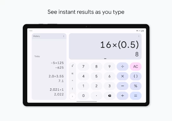
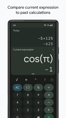
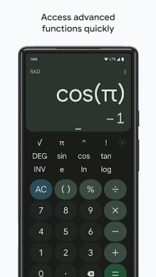
• Do scientific operations such as trigonometric, logarithmic, and exponential functions
Latest Version
8.6 (612662282)
June 15, 2024
Google LLC
Tools
Android
2,214,584,115
Free
com.google.android.calculator
Report a Problem
User Reviews
Nicole Rappaport
4 years ago
The interface that came with the new update is awful. They've moved buttons around so it's no longer intuitive, I'm constantly accidentally hitting the equals button before I'm ready and then having to start over, it won't show sums until I hit equals when I use it in split-screen mode (which I used to regularly do while doing my monthly budgeting), split screen mode buttons are so small they're near impossible, I could go on and on. Hope they change it back asap.
Twelve Entertainment
4 years ago
Absolute trash.,. They changed it to absolute trash. I run multiple businesses, I use the calculator all day long to figure different aspects of my business with finance. And now they made it nearly intolerable to be able to do quick calculations. This new format changed to the calculator is the worst thing that they could have possibly done to this app. At least give us the option in the app to go back to the classic design.
pepperVenge
2 years ago
Had this calculator for a very long time. It was perfect! I would have given it 5 stars. But i made the mistake of updating it.. They changed everything about it! The color, the style, they even changed the location of buttons which screws up muscle memory. Worst of all, the delete button no longer clears the field if you hold it down. Now, if you hold the button down, nothing happens... I got rid of this app and found another. Still different, but at least it has the functions I'm used to.
Matthew Ellenberger
4 years ago
New doesn't mean better. I had used this app for some time, and was quite content with it... Until the update and unwanted redesign. It will not allow me reverse the damage done by the October update, so it looks like I need to find a replacement with less irksome visuals. If an option becomes available to return to the previous version's design, I will reconsider my decision to delete Calculator. Thank you.
Amrutha Amarnath
4 years ago
I have used this app for years with no complaints. The new update has made the app much more unpleasant to use. It is not at all aesthetically pleasing. There is only one button for paranthesis now, which makes typing in complicated equations much more difficult because it always assumed you're trying to close the previous set of paranthesis instead of opening a new set. You can also no longer long press the backspace key to clear the screen. Not sure why they messed with a good thing
Peter Larson
4 years ago
I liked the old calculator before the design changes. It was intuitive, clean, and fast. I tried to give the new look a chance, but it's "flashy" at the expense of simplicity. A clear example of form before function. There is a very strange double tactile feedback on presses and quickly typing (sliding from the initial number to the next without a long lift from screen) will prevent the number from being registered. Also no more hold "backspace" to AC. Deleting App. I'll return if reverted.
Darshan Rivka Whittle
4 years ago
The update makes the keyboard vibrate twice in rapid succession per key press, and it's absolutely alarming, overstimulating, and overwhelming. I hope it's a bug that is fixed ASAP, but if someone is trying to make it like a physical button clicking down and clicking back up, please know that many users will find this horrific and antagonist, and please allow us to turn it off. I can't use it currently. Thanks.
Liz
4 years ago
CHANGE IT BACK. It was perfect the way it was. Tell the new intern they're not being innovative, they're being annoying. If you want to change anything, do something fun like let us be able to customize the background with a picture or use different colors for the buttons. But please keep the original format. It was efficient and actually made sense for doing calculations on a regular basis.
John Perry
4 years ago
Screenshots provided are of old interface, which looked half professional. The new interface looks as if it were aimed at 2-year olds. Whose idea was it to introduce themes but not allow one to retain the old theme? That aside, the calculator is surprisingly good. It isn't merely functional; it also reports exact answers on many occasions where it could get away with approximations. For example, fractions are often displayed along with decimals, and it will even do sin(π/3) correctly! Nice!
Nathan Edwards
4 years ago
This new update is horrendous. I used this app multiple times a day for my job and I loved it. It was easy to use, had a nice, professional design, and showed progress during longer calculations so I could correct mistakes as I went along. Now it looks like a child's toy. The layout has changed completely for no reason and it vibrates like it's having a seizure at every button press. Who's idea was this? I wish there was some way developers could see how many people delete their apps.
Rhys Blatt
4 years ago
It was fine. Nothing spectacular, but a simple calculator doesn't have to be fancy. However, after the recent update all the buttons are set to "blind grandparent" size, like if you went to your accessibility settings and selected "visually impaired". My screen's 6.6" and the 5 rows of buttons take up almost 5". For serious? One-handed days are a distant memory.
Isabella Routten
4 years ago
It was super useful and easy to read, I always used it as opposed to the one on my iPad simply because of the layout, but they changed it, it's like they were trying to copy iOS, the icon doesn't even match with the actual app, not only that but you have to tap multiple times or press the AC button (which took me forever to find btw) to delete everything rather than holding down on the delete button, you also can't preview answer anymore. It's hard to use and even look at.
Sarah Fredrickson
4 years ago
The old interface was great, simple, easy to use. I opened up the app and was confused after the recent update. At first, since it looked so different, I thought it was maybe a different app. I have had the screen part (vs the number and symbol part) scroll somewhere I can't see the calculations. The new design is frustrating vs intuitive and easy to read. Somehow they made a calculator annoying to use. Can't even uninstall it and now it's going to my bloatware folder.
Jeremy Clark
4 years ago
I used to love this calculator! So easy to use, very responsive, simple and intuitive layout. But then someone somewhere decided it needed an update. Awful So slow, so unsightly; I hope desperately that they revert back to the previous version. I don't want to have to find a replacement when this one was everything I wanted in a phone calculator.
Nichole Preston
4 years ago
The new update is why I'm here. I use the calculator so much it's one of the most frequent used apps on my phone and the last update is driving me away from it. The UI is completely different and less intuitive. Maybe it's just because it'll take getting used to the new layout, but it matched most calculators I've used before. Now I find myself hunting for the back and clear keys. Additionally, it added heptic feedback on key presses, this feature alone is a deal breaker as you CAN'T DISABLE IT.
Airy Fu
4 years ago
I agree the new update ruined it. A design Change they believe is better aestheticly? Fine. Upon seeing (before using)the visuals neither cause a positive or negative reaction. However, it's navigating and issue, being quite difficult now(even taking into consideration that it takes time adjusting to change). Taking away calculator components required to work as one is a VERY big issue. Most annoying? No practical way to clear. No button, special tapping. Just hold, select all, back button.
Ναθαν
3 years ago
New UX is Horrible. The app used to be great, not on par with a graphing calculator, but very functional. The recent update rearranged the buttons and now the backspace must be hit repeatedly to delete each character, rendering it horrible to use. Additionally, I think the look has not improved, but that is barely worth mentioning in the face of the other issues.
kitty cat
4 years ago
please return it to its former layout. I loved this, used it every day and it was perfect. Now they've changed the layout making it big and bubbly, I feel embarrassed to use it, its awkward to type, and I want the old layout back. If it was changed to make more accessible for people with disabilities then at least make this new format OPTIONAL for those of us that used and loved the old version.
Melissa Durazo
4 years ago
I dislike the new update. It's not practical. For years this app didn't change it's look and function, and it worked great. Now, for whatever reason, you've decided that changing it would be a great idea. Sadly, the new layout is not a win. And, I'll be uninstalling this app and looking for a calculator app that has the same look and function as your last format. ☹️
Ryan Bonner
4 years ago
Finally! The layout is fixed! No more empty space. I love the new animations and how the scientific menu drops down and just squishes the other buttons so I can see everything at once. Although, I do wish it had conversions built in like, length, time, currency. And the background on the numbers, decimal, delete, and scientific menu arrow buttons are a little difficult to distinguish from the background of the app. I'm on Android 12 on a Pixel 4 XL.
