Ares Arctic Minimal Icon Pack
September 17, 2025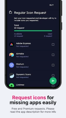
More About Ares Arctic Minimal Icon Pack
How to apply a custom icon pack
Our icon pack can be applied on almost any custom launcher (Nova launcher, Lawnchair, Niagara, etc.) and some default launchers like the Samsung OneUI launcher (bit.ly/IconsOneUI), OnePlus launcher, Oppo's Color OS, Nothing launcher, etc.
Why do you need a custom icon pack?
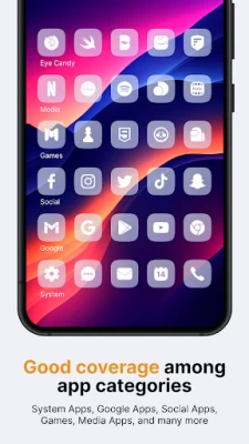
Using a custom Android icon pack can enhance the look and feel of your device. Icon packs can replace the default icons on your home screen and app drawer with ones more appropriate for your style or preferences. A custom icon pack can also help to unify your device's overall look and design, making it appear more cohesive and polished.
What if I don't like the icons after purchasing them, or if there are many missing icons for the apps I've installed on my phone?
Don't worry; we offer a full refund within the first 7 (seven!) days of purchasing our pack. No questions asked! But, if you're willing to wait a little longer, we update our app every week or two, so many more apps, including those you've missed, will be covered. We also offer Premium icon requests if you want to skip a line. Those apps are included in the next (or second next) release from the moment they are sent to us.
Want to know more?
If you want to know more about our icon packs, check out the FAQ section on our website - https://www.one4studio.com/apps/icon-packs. You will get answers about supported launchers, how to send icon requests, and more.
Having more questions?
Don't hesitate to write us an email/message if you have a special request or any suggestions or questions.
Need more wallpapers?
Check out our One4Wall wallpaper app. We are sure that you will find something for yourself inside the app.
We sincerely hope that you will love our Ares Arctic icon pack!
Website: www.one4studio.com
Twitter: www.twitter.com/One4Studio
Telegram channel: https://t.me/one4studio
More Apps on our Developer page: https://play.google.com/store/apps/dev?id=7550572979310204381
Latest Version
2.0.6
September 17, 2025
One4Studio
Tools
Android
921
$3.49
one4studio.iconpack.aresarctic
Report a Problem
User Reviews

Mukhriz T
2 years ago
Good IP.

Espen Laub
2 years ago
👍

Kushal Wagh
2 years ago
One of my favourite 😍

E
2 years ago
Inlove with your work! The icons feel premium af :)

Aliraj Hossain Sojib
2 years ago
Amazing icon pack🤩🤩🤩

Bhupender
2 years ago
Superb icon pack, best developer 💯

Bigmomma roper
2 years ago
It won't load when I hit apply can you fix

Aadya
2 years ago
Beautiful and so unique icons 😍 loving them 🔥

Rohit Kumar
2 years ago
Amazing minimal icon pack.

surya kh
2 years ago
Very clean and transparent icon pack 😍 stunning look

Ben fulcher
2 years ago
What an amazing theme had it from day one it's very well looked after and the person who made this has some skills

Dhilipan Chakravarthy
2 years ago
A minimal specific themed icons... One of a best icon packs from d dev 😍😍

Raza Haider
2 years ago
Some icons are missing but one the best minimal icon pack hats off to Dev

vishwajeet
2 years ago
These go so well if you are going with a glass/transparent theme for your set-up. One of a kind icon pack with regular updates 💯

Jose Rodriguez
1 year ago
Was unsure about this one but once applied to my screen , really loved it. The transparent icons look amazing with the choice of all the wallpapers in the pack.

Matt W
2 years ago
What would a minimal homescreen be without minimal icons... If you're the sort that requires the simplest of icons to pair with a minimally themed pack, Ares Arctoc Minimal is an excellent choice with its deepish white icons. This icon pack works great with darker backgrounds, keeping your homescreen clean with no colors in the icons to break up the slick look, app is still being updated daily and always after icon requests for icons that they have missed and happily apply on their next update.

Ishan Campbell
1 year ago
I'm in love with this icon pack, and I'd be more than happy in supporting for some of my favorite icons that haven't been themed yet, but I'd be even more happy/in love if unthemed icons were made to be monochrome/greyscaled, as it would entirely future-proof things... forever helping in making the icon set a lot more uniform/consistent. Thank you again. And job well done! Edit: Namida's current illustration makes me so sad... I wish it had stayed a little more true/close to the original design